PLEASE REMEMBER THIS IS FOR EDUCATIONAL PURPOSES ONLY!
Greetings all,
Using ProfitSource, I first came across DHI on 1/12/07. For those of your unfamiliar with the company, DR Horton is a homebuilding/financing company listed on the NYSE. For a company profile you can look here:
http://finance.yahoo.com/q/pr?s=DHI
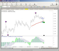
What is interesting to me, is that the media has been bombarding our senses with the doom and gloom of the real estate market for quite awhile. I've always been a "against the masses" type of guy, but I've also made the mistake of being "against the general market". Here lies the dilemma. Do I really think the housing market is all doom and gloom, or do I think the big boys are looking at opportunity. For now, here's the chart I saw on 01/12/07:
 For me, I don't feel frisky about pulling up a precomputed scan, selecting a risk to reward ratio that's acceptable and then placing the trade. I think their are several questions that need to be asked before moving forward. For me, I don't feel frisky about pulling up a precomputed scan, selecting a risk to reward ratio that's acceptable and then placing the trade. I think their are several questions that need to be asked before moving forward.
1. I know that Profitsouce will pull up these scans by criteria already set, but I still like to confirm these criteria by hand. At the very least, it allows you to become more familiar with the software tools.
2. Before I go through all that business, "THE PICTURE" still has to be right (i would say feel right, but that has got me in trouble before). In my experience, the closer the chart looks like a true Elliott wave pattern, the closer it seems to be in reality. All those charts with huge swings, gaps up and down, etc have their place, but that volatility thing can make or break ya. There's nothing worse than seeing a trade that goes in the intended direction, but the option's price is stagnant or decreases. Being primarily an option trader Volatility has become my best friend and my worst enemy. And since I'm looking at this from the biased eyes of an option's trader, I still have to pull up a risk graph from another source to see if it's Picture is inline with my overall strategy.
3. What is the long term picture looking like. It's great to take a snapshot of few weeks of data, but where has the price been before. This is always important to analyze points of support and resistance. It also lets you get an idea of how big a swing will effect the price based on past events, earnings, news, upgrades, downgrades, etc. The first chart was a daily graph from a small time frame and the next chart is the weekly view over several years.
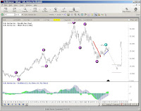
Notice how the wave patterns for the long-term and short term are strikingly different.

4. Wow, did you notice the TAPP's. The first screen shot cut it off, but its 29.05 by March 14,2007. The weekly chart has a TAPP of 16.03 by August 10,2007. Well which way is it going to go, thats a range of 13.02. Maybe none, maybe both. I do know that once you start applying the range projector tool, the tool itself will have no directional bias in its forecasting. Don't take my word for it, check out the Profitsouce tutorials and they will say the same thing. So if we go back to the original daily chart we can have two possible targets to view. Look to the left:

5. Overlaying the 21, 50, and 200 SMA, you can see several different results. I would classify myself as a short to mid-term trader so the 21 day SMA works fine for me. This allows me to get a feel of the short term movement over the last 3 weeks. The 50/200 SMA is one I almost always use primarily because everyone else does. Sometimes, it feels as though the 50/200 SMA becomes a self-fulfilling prophecy... at least in the short-term. Whether it truly predicts the price movement in the long-term is less important to me than whether the majority of investors BELIEVE it predicts the price movement. If the antelope herd is being chased up hill by a lion, so be it...even if the lion turns out to be a....monkey..no...a giraffe...no...probably another ANTELOPE. You can also see that the EBOT has been satisfied. Here's the view:
6. I had mentioned earlier about confirmation of the EW pattern early. Next we will confirm that the that the ratios look right. Just a side note: I always like to perform a custom Data on Demand of a least 5 years to make sure my data doesn't have any holes in it. Well, how much should Wave 4 Pull back, and what tool can I use. For the EW4B Pattern, the range is usually between 24-62%. I use two different tools to perform the confirmation and you can use either one. The first one is the Fibonacci Retracement tool and the second is the Wave extension tool. The first screen shot includes the tools, the other two represent the final display of the two tools, and how they look a little different.

Fibonacci Retracement Tool and Wave Extension Tool in the Drawing tools Menu

Application of Fibonacci Retracement Tool on Price Chart

Application of Wave Extension Tool on Price Chart
Check back with me later....I'm not finished yet
Continued in Part 2
By the way, the STZ trade posted earlier was a losing trade and I'll finish it up too
Later, Fibonacci
If you like the blog, visit the forum at www.primalgreed.com Let's Network!
PLEASE REMEMBER THIS IS FOR EDUCATIONAL PURPOSES ONLY!Labels: Elliott Wave, Part 1, Profitsource, Wave 4 Buy |


