|
| Is my backtested trading system back far enough? |
| Monday, July 9, 2007 |
Greetings,
I have been doing an enormous amount of backtesting in Profitsource recently, and there are a few systems that may be hopeful. Usually my first backtesting goal is to reach the 51% mark for winners versus losers over a five year period. I don't see any sense in doing some fine tuning until I can beat the probabilities by at least 1%.
Yesterday, I somehow stumbled onto a 75% winners versus losers system on the S&P and DOW and I was instantly dumbfounded. This has happened many times before, but not on a data range of 5 years. Here is my initial results from Profitsource's System Builder.
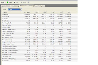
As you can see, the winning trade percentage was 75.71% with an average trade profit of $769.52. Total Profit was $53866.61 from 70 trades. Keep in mind, that this was also based upon a $100,000 trading account starting from 2003 and ending in July 2007. Feeling the luck of the triple 7 calendar (07-07-07), I decided to blindly tweak to my hearts content. After a few hours of tweaking the parameters, this is what I came up with:

System is now sitting at 80.36% winners versus with only 56 total trades. The average winning trade has also increased to $968.27 with a total profit of $54223.24. Now the biggest question is "did I backtest far enough back?" That will have to be left for another post.
What was the system? Let's do some more backtesting first!
Later, Fibonacci
Index for all blog postings
PLEASE REMEMBER THIS IS FOR EDUCATIONAL PURPOSES ONLY!
If you like the blog, visit the forum at www.Primalgreed.com Let's Network!Labels: Losers, Profitsource, System Testing, Winners |
posted by Fibonacci_Trader @ 4:53 AM Add to: DiggIt! | Del.icio.us | blink it |   |
|
|
|
| Data Recovery - A Hard Lesson to Learn |
| Saturday, June 2, 2007 |
Greetings Everyone,
Several weeks ago I was doing some backtesting in Profitsource, and the backtesting was working fine...at least up to 18 hours. Yes, that's right, I said 18 hours. One thing that is always hard for me to resist is taking a huge data sample and running a backtest or two for several criteria. Sometimes it may be Elliott Wave, other times it may be a simple moving average. Typically this isn't that big of a deal, but that 18 hour thing along with the huge data sample brought my RAM to its knees.
At first, I didn't think much of it. I closed out Profitsource and I said to myself, "I bet I have a lot of junk I need to clean out of this computer, lets do a disk cleanup" You can see where this is going! I can't say it's the Profitsource. More likely the evil culprit was my RAM deprived system along with Willie Gates wonderful software we have all grown to love.
My system did the disk cleanup and asked for a restart...No problem...I've been there a million times before. When the Windows screen was trying to load, I received a friendly message that something was missing from my XP system. Not knowing what the screen was missing I called a friend of mine. He said on the phone, "Man...looks like your gonna have to reinstall!" On the old Windows 98 system, that never use to be a problem. I routinely wiped my hard drive clean every 6 months just to keep my 20 GB hard drive from going into system overload. A few questions immediately ran through my mind, "What have I backed up?", "If I backed it up, where did I put it", and most importantly, "I gotta look at my option positions before day break, wheres that old computer?"
After taking a few minutes to size up the situation I said, "well, I can't find that old computer, but I got the WIFI Pocket PC". That was all it took to ease my mind and continue with my daily habit of reviewing my equity and option positions. Now I'm back to data preservation mode. While looking at some positions on the little 4 inch by 3 inch square of my Pocket PC I began to wonder whether my system tests and literally hundreds of charts from Profitsource where still retrievable. I started thinking back at the countless hours upon hours I had spent gathering charts, analyzing, etc. I grabbed me a cup of Starbucks and said to myself, "It will be allright, I'm gone get crackin on this tommarow.
The next day came, and I made a few calls to some computer shops and data recovery services. The prices for recovery services ran from a minimum of $300.00 to around $2500...ouch that hurts! After stewing on it for a while, I pulled out the recovery disk and fired it up. When the screen pulled up, it asked me for the admin password to proceed to a restore point. I faithfully typed it in and ...NOPE...no go. The recovery disk hauntingly asked me over and over again for the correct password, and like a robot, I faithfully kept typing it in to no avail. "How can this happen..this piece of &*)%" Either out of sheer frustration or maybe just being cheap, I tossed the restore frisbee back in and went for the reinstall. The choices it gave me were to either do a clean install with no data saved or "we won't fully wipe you out, we will try to save something, but no guarantees". I jumped at the No Guarantee option.
The reinstall went fine...that is...until I tried to find my data that Windows had attempted to save. It was GONE...all GONE. Fortunately for me, I stumbled across a handy piece of software. The software ran me about $70/$80 bucks, but when it recovered 27GB of information I was more than happy I paid the price. Not only was my WORD, EXCEL, and Family JPEG's saved, but my all important Profitsource Charts. I did have to reinstall some software, but other than that...no worries.
I'm not trying to sound like a Ad here, but I was so impressed with the software I thought I would post it here. The name of the software is RECOVERMYFILES.
One more helpful note, if your Profitsource CD is more than 6 months old, call up tech support to send you an up-to-date data CD. First, because it was free and second, because I had to download a year and a half of data...and it wasn't pretty.
Later
Fibonacci 
Index for all blog postings
PLEASE REMEMBER THIS IS FOR EDUCATIONAL PURPOSES ONLY!
If you like the blog, visit the forum at www.Primalgreed.com Let's Network!Labels: Backup, Data Recovery, Profitsource |
| posted by Fibonacci_Trader @ 6:26 PM Add to: DiggIt! | Del.icio.us | blink it | |
|
|
|
| The Standard Deviation Channel and EBOT’s in Profitsource |
| Tuesday, May 29, 2007 |
Greetings Everyone,
I recently was looking at another forum where an individual asked why EBOT’s in Profitsource appear to be missing from time to time. I have heard this question several times before and had this question myself a while back.
My biggest concerns when I hear this question over and over again are:
1. If you are trading via a system that stipulates a certain EBOT level, did you make trades outside of that system?
2. Have you contacted a HUBB trading tutor and have them explain the why and why not of the EBOT’s? I don’t know why people don’t want to call; this has to be one of the best features of Profitsource and it’s free!
3. Have you checked the Profitsource Knowledgebase to see if this question has already been answered?
4. Have you reviewed and studied the Video Training Modules from Profitsource?
5. Have you ever used the Data Window in Profitsource?
6. If someone asked you to determine a future EBOT level using the Profitsource Drawling tools….could you do it?
If you’re using the Elliott wave precomputed scans for trading opportunities and you don’t have the motivation or desire to honestly answer these questions: SHAME ON YOU! Fortunately, I see that your here, so I’ll do my best with the small brain I have to work with.
If you want a Profitsource answer to the EBOT disappearing question do both of these:
1. Go to the Profitsource Knowledgebase and perform an “any word” search for “1412”. The title of the question is “Why isn't there an EBOT in some precomputed scans?” This gives a little detail into why some EBOTS show on the precomputed and some do not.
2. Another good resource is the training modules. The specific module is 'Elliott wave in Profitsource' and the sub-module is 'EBOT's'
In a nutshell, the EBOT's are actually there, but they haven't crossed above/below the level and/or specific timeframe of trading days to generate the visual EBOT.
Has everyone used the Data Window in Profitsource? If not, you need to give it a look. If you find an Elliott Wave precomputed that doesn’t have a visual EBOT, the EBOT level may be reflected in the Data Window. If you don’t know where the Data Window is, here is a screenshot:

This second screenshot has the Data Window open. From the chart, you can see that there is no visual EBOT level being shown on the screen, but the Data Window is showing a Wave 3 and Wave 4 EBOT level. This was given by hovering over the day marked by the red arrow.

Now that you can see that the EBOT still appears, do you think I can predict the EBOT level in the future? I believe I can, and probably within 99.8% of the price, 100% of the time. “Hold on now Big Daddy”, you say, “What you’re saying is kin to evil!” It seems like that at first, but once you see it…all the magic is gone.
Here is the step-by-step that might help you understand how the EBOT is generated and where it will be in the future. Right now, I’m just going to show you a Wave 4 Precompute buy with a missing visual EBOT. The one I choose was ATW from 5-23-07.
One more thing, close your data window. It will ruin the surprise
1. Pick a wave 4 buy, the one I picked was ATW from 5-23-07. Notice that ATW does not have visual EBOT
2. Click on the Standard Deviation Channel tool under the drawling tools (don't get this confused with the one under the indicators)

3. Click on the day the wave 3 bubble shows up

4. Then click on the day the wave 4 bubble shows up

5. Right click on the Channel to open the channel properties

6. Change the Top and Bottom Deviation to 2
7. Set the 'Calculate Using' to Close
8. And check the tick mark for 'Extend to right'
9. Select OK

10. Now pick any day after the Wave 4 Bubble and draw a vertical line right over top of that day and take a look where the Top of the Standard Deviation Channel intersects with the vertical line you just put in

11. Now draw a horizontal line to match up with the intersection, and see what value pulls up on the right hand side of the horizontal line. (I zoomed in to make it line up perfect). The value shown is $51.04

12. Now open up you Data Window and hover over the day you selected for your vertical line. What do you see?

13. Here is what additional dates would look like

Other Question to Consider:
Q: What about the dates in the future?
A: If the main Elliott Wave pattern hasn’t changed, the results will be the same.
Q: Can I apply this to Wave 5’s?
A: Yep, but the Standard Deviation Channel settings are different.
Later Fibonacci
Index for all blog postings
PLEASE REMEMBER THIS IS FOR EDUCATIONAL PURPOSES ONLY!
If you like the blog, visit the forum at www.Primalgreed.com Let's Network!Labels: EBOT, Profitsource, Standard Deviation Channel |
| posted by Fibonacci_Trader @ 4:49 AM Add to: DiggIt! | Del.icio.us | blink it | |
|
|
|
| Profitsource Bollinger Bands and Standard Deviation |
| Monday, March 5, 2007 |
PLEASE REMEMBER THIS IS FOR EDUCATIONAL PURPOSES ONLY!
Continued from Part 1
Greetings, I hope recent market downturn hasn't discouraged you.
Previously, we had dived into Profitsource trying to discover the Bollinger Band Tool. From earlier, we discovered that Bollinger Bands had early origins in Trading bands. Trading bands form off a centerline, which is a configurable moving average. The Outer bands from Trading bands can be adjusted by a given percentage, up or down, from the moving average. Now we move on to Bollinger Bands
Earlier, we had discovered that Bollinger Bands are based upon Standard Deviation, and I'm sure many stopped and said "OH NO!" Not to worry, I had to do a little refresher research myself.
Sidenote: If you are currently using Bollinger Bands for trading signals, confirmation, etc, and don't already have a decent grasp on most of this...SHAME ON YOU!
 Q: Well, what is standard deviation? Q: Well, what is standard deviation?
A: Standard deviation is based upon the average or mean of a data group. The standard deviation itself expresses a clustering or grouping density around the mean. This is visually represented in a bell graph. A bell graph is to the left, Courtesy of Wikipedia. The dark blue represents One Standard Deviation from the mean. The lighter blue represents Two Standard Deviations from the mean, and the lighest blue indicates Three Standard deviations. For example, my data sample could include the total amount of cookies baked in 2006, and how many chocolate chips are in each of them. The centerline drawn down through the peak of the graph could represent the average amount of chocolate chips per cookie over the entire data group. The dark blue would indicate that 68.26894921371% of my cookies have a One Standard Deviation amount of chips from the mean. The lighter blue would indicate that 95.44997361036% of my cookies have a Two Standard Deviation amount of chips from the mean. Keep in mind that Two Standard deviations is the first deviation plus the second deviation. I could keep going on, but I'm starting to get hungry...munch...munch.

Now that I finished brushing the crumbs off the keyboard, can you see how this would apply to equity price movement? If I'm going to use Bollinger Bands, I probably need to get an idea of the size of my data group size and I also need to determine how many Standard Deviations I want to include for my given sample size. Looking at Profitsource's Bollinger Band Tool Properties, I see that both of these fields are available for me. The periods would be my Data Group, and the Standard Deviations would be the amount of Standard Deviations I want to apply to the Data Group.
Here is a list of the percentage of data from the data group that will fall under various standard deviations.
One Standard Deviation 68.26894921371%
Two Standard Deviations 95.44997361036%
Three Standard Deviations 99.73002039367%
Four Standard Deviations 99.99366575163%
Five Standard Deviations 99.99994266969%
Six Standard Deviations 99.99999980268%
Seven Standard Deviations 99.99999999974%
Deviation Percentages courtesty of Wikipedia
Before you start getting all excited, remember that the accuracy of these percentages depends on the size of the Data Group. Let me show you a couple charts from Profitsource to make things a little clearer.

Here is a chart with the data group being set to Profitsource's default. The default setting is 20 periods (data group), and 2 standard deviations. Notice how the majority of the price movement is included, but not all. Two standard deviations should include 95.44997361036%, but this doesn't look to be the case. If the periods or data group was larger, these percentages might fall into place. Lets changes some parameters and see what happens.

Here is the same chart, but with the amount of standard deviations changed to 4 instead of 2. Now, even though our sample is small, all the data is encompassed by the Bollinger bands. What if we had left the Standard Deviations at 2 and just increased the data group? Let's try that one as well, but I'm sure it will not be the result most people expect.
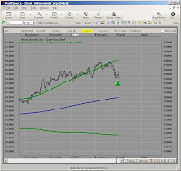
Wow, what happened here? The standard deviations was set to 2 and the periods where changed to 200 versus 20. You would think that increasing the data group or periods size would make the Bollinger Bands all encompassing. If we keep in mind that the standard deviation is a measurement from the mean, maybe things will become more clearer. Remember that a recent large price movement or trend can skew the graph. Let's back the chart up a little
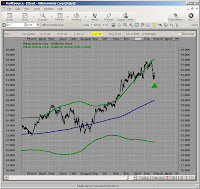
You can see now that there has been some serious movement over the last 200 days. Most of the movement seems to be hugging the upper band, but there was a lot of movement below the band as well. So is the data group or period encompassing 95.44997361036% of the price? Not exactly, but the larger the sample, the closer the percentages.
Don't take my work for it though, try some of this stuff yourself and see what you come up with. I have more to come, but if your like me, you have to digest this slowly....where are those cookies?
To be Continued in Part 3
Later Fibonacci
PLEASE REMEMBER THIS IS FOR EDUCATIONAL PURPOSES ONLY!
If you like the blog, visit the forum at www.Primalgreed.com Let's Network!Labels: Bollinger Bands, Part 2, Profitsource, Standard Deviation |
| posted by Fibonacci_Trader @ 7:30 AM Add to: DiggIt! | Del.icio.us | blink it | |
|
|
|
| Primalgreed.com - BESTBUY, that's not what I wanted! Part 3 |
| Monday, February 26, 2007 |
PLEASE REMEMBER THIS IS FOR EDUCATIONAL PURPOSES ONLY!
Continued from Part 2
Greetings All,
Finally back to finish up BBY. If you remember from the last post, we had applied Profitsource’s risk to reward tool, with a stop price that was set at the Elliot Wave 4 peak of $51.80, the entry price was around $50.08, and the profit point was at $44.85. We also concluded from the risk to reward tool that shorting the stock would give us a 1 to 3.16 risk to reward, but the question was whether an option could give us a better return.
 Looking at the risk graph from Optionetics, you can see that the March 50 Put for BBY could yield a $350.00 per contract profit for around $80.00 per contract risk. This leaves me with a risk to reward of 1 to 4.375 ($350.00 divided by $80.00), definitely more attractive then the 1 to 3.16. Of course, with option trading, these risks to rewards can be somewhat deceiving, especially if your timeframe is too short, or the option is too far OTM (out of the money)…among other things. Looking at the risk graph from Optionetics, you can see that the March 50 Put for BBY could yield a $350.00 per contract profit for around $80.00 per contract risk. This leaves me with a risk to reward of 1 to 4.375 ($350.00 divided by $80.00), definitely more attractive then the 1 to 3.16. Of course, with option trading, these risks to rewards can be somewhat deceiving, especially if your timeframe is too short, or the option is too far OTM (out of the money)…among other things.
The model price for the option was $1.698 with a bid/ask of 1.65/1.75, the opening interest was around 9360 contracts, and the IV was 27.0%. I placed my order to buy at $1.65, initial stop at $0.85 and a half-profit taking at $3.70 (I always buy a minimum of 2 contracts). The order was filled on 01-30-07 at $1.65 per contract, and now we are off to the races.

From the screen shot, you can see that over the next few days the movement started to change from a sideways movement, to an upward movement. I began to notice that the 200 SMA had been tested before, and it looked like it was going to be tested again. The Elliott Oscillator had also started an upward trend, and the Daily Trend finder was indicating upward movement. My original stop point was $0.85 per contract, but after looking at the overall picture, decided to take my current losses at an exit price of $0.95 per contract.
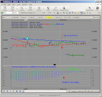
The last screen shot is the continuation up to 02-22-07. There still seems to be some sideways movement, but recently the Daily Trend finder and the Oscillator are starting to go in the direction I intended to begin with. All that being said…..WHO CARES! The trade is over, and its time to learn from the mistakes of the trade.
In hindsight, there are at least several mistakes I made with this trade.
1. The price action already seemed sideways, and the Elliott Oscillator just didn’t feel as right as it should be.
2. I remember placing this trade under a less-than-perfect emotional state.
3. The option timeframe was too short (46 Days)
4. It is very possible my losses would have been smaller had I went ITM or deep ITM (in the money).
5. I’m sure there are many others; this list will have to be added too
I will add the Final Stats to this Later
Fibonacci
If you like the blog, visit the forum at www.Primalgreed.com Let's Network!
PLEASE REMEMBER THIS IS FOR EDUCATIONAL PURPOSES ONLY!Labels: Elliott Wave, Part 3, Profitsource, Wave 4 Sell |
| posted by Fibonacci_Trader @ 11:35 AM Add to: DiggIt! | Del.icio.us | blink it | |
|
|
|
| Bollinger Bands Tool in Profitsource – Part 1 |
| Wednesday, February 21, 2007 |
PLEASE REMEMBER THIS IS FOR EDUCATIONAL PURPOSES ONLY!
Greetings Everyone,
Once again, we come across another tool that is very familiar to most, but the settings, application, and interaction with other tools / indicators is usually met with…HUH! So first of all, what are Bollinger Bands and how did they get started.
Bollinger Bands were created by John Bollinger who is the President and founder of Bollinger Capital Management. Mr. Bollinger’s site can be reached at www.bollingerbands.com. If you want to read the book directly from the author, you can find it here: Bollinger on Bollinger Bands
According to Mr. Bollinger, the origins of Bollinger bands started with trading bands. Well that’s great, what are trading bands. In this session, we will look at trading bands, in the following sessions; we will get more into Bollinger. Trading bands are merely a group of lines that usually encompass the majority of price action over a given time-frame. For example, the chart below shows how the price action on a given time frame is enclosed in a price envelope. The chart was formed by using a combination of the MA.B or Moving Average Bands tool and a simple moving average.

The first step in creating the chart was to first determine what moving average I wanted to include. The one I randomly chose was the 20 day simple moving average close. This gives me the green line in the center of the chart. The second step was to overlay the moving average bands. The moving average bands were also set to the close for a period of 20 days and a plus 5% and -5% for the band width. The percentages for the MA.B are a matter of preference, but to make the bands look correct, the periods should be the same. Here are the properties boxes for the Simple Moving Average followed by the properties box of the Moving Average Bands.

Simple Moving Average Properties

Moving Average Bands Properties
So what have we created? We have created two parallel lines that are a set percentage distance from the moving average. This does not mean that we have to make the parallel line equal in distance because we could easily go back to the Moving Average Bands properties box and adjust the Top or Bottom percent field to our individual preferences. Here is an example with the Top percent field remaining at 5% while the bottom has been reduced to 2 %.

Trading Bands with Reduced Lower Percentage Band
Ok, now that we have Trading Bands out of the way, how is Bollinger different than Trading bands, and how can I use it. For now, Bollinger Bands calculate the distance of the bands from the moving average based upon Standard Deviation. Standard Deviation! Oh no, what have I gotten myself into.
Continued in Part 2
Later Fibonacci
PLEASE REMEMBER THIS IS FOR EDUCATIONAL PURPOSES ONLY!
If you like the blog, visit the forum at www.Primalgreed.com Let's Network!Labels: Bollinger Bands, Moving Average, Part 1, Profitsource, Trading Bands |
| posted by Fibonacci_Trader @ 9:45 AM Add to: DiggIt! | Del.icio.us | blink it | |
|
|
|
| Highest High and Lowest Low Tool in Profitsource |
| Saturday, February 17, 2007 |
PLEASE REMEMBER THIS IS FOR EDUCATIONAL PURPOSES ONLY!
Greetings,
This is an example of the application of the HH (Highest High) and LL (Lowest Low) tool within Profitsource. If your not looking for a moving average of price movement and simple want to see the high or low over a given period of time, this may be the tool for you. My personal setting range from mid-term to long periods, but you can configure the period however you want. Here's the example:
Later,
Fibonacci
PLEASE REMEMBER THIS IS FOR EDUCATIONAL PURPOSES ONLY!
If you like the blog, visit the forum at www.Primalgreed.com Let's Network!Labels: HH, High, Highest, LL, Low, Lowest, Profitsource |
| posted by Fibonacci_Trader @ 9:15 AM Add to: DiggIt! | Del.icio.us | blink it | |
|
|
|
| Trading / Calendar days setting revisited in Profitsource |
|
PLEASE REMEMBER THIS IS FOR EDUCATIONAL PURPOSES ONLY!
Greetings,
Further Clarification of Trading vs. Calendar days from the main chart in Profitsource. I had went the long way around in adjusting the chart properties. This is a bit easier, but the last example from the Time Analysis Tool Post is still helpful if you want to save as defaults to the charts. There are also some additional tips about the configuration in the chart properties screen in Profitsource. Check it out.
Later,
Fibonacci
PLEASE REMEMBER THIS IS FOR EDUCATIONAL PURPOSES ONLY!
If you like the blog, visit the forum at www.Primalgreed.com Let's Network!Labels: Calendar, Profitsource |
| posted by Fibonacci_Trader @ 8:46 AM Add to: DiggIt! | Del.icio.us | blink it | |
|
|
|
| Time Analysis Tool in Profitsource |
| Friday, February 16, 2007 |
PLEASE REMEMBER THIS IS FOR EDUCATIONAL PURPOSES ONLY!
Greetings,
Sometimes it may be necessary to outline a consistent timeframe pattern to spot weekly, monthly, yearly, etc trends in price movement. The Time Analysis tool gives you this handy feature. The downside to the tool is the manual configuration of the initial timeframe, but other than that...it can be very handy. Below is a small review of the interim tool followed by an example of a time analysis application.
Later,
Fibonacci
PLEASE REMEMBER THIS IS FOR EDUCATIONAL PURPOSES ONLY!
If you like the blog, visit the forum at www.Primalgreed.com Let's Network!Labels: Analysis, Profitsource, Timeframe |
| posted by Fibonacci_Trader @ 7:04 AM Add to: DiggIt! | Del.icio.us | blink it | |
|
|
|
| Using the Interim Time Frame Tool in Profitsource |
| Thursday, February 15, 2007 |
PLEASE REMEMBER THIS IS FOR EDUCATIONAL PURPOSES ONLY!
Greetings Everyone,
One important consideration for any price movement is timeframe. While it feels great to apply a range projection, look at the TAPP (T- Target, A-And, P-Price, P-Projection), and say “this should move to $XX.XX by such and such date”, sometimes it may be useful to analyze the time frames of previous movements. There are several tools you can use for timeframe analysis in Profitsource, but maybe we should start with one of the most simplistic, the Interim Time Frame Tool.
There are two ways to get to the Interim Time Frame Tool, and this applies to Drawling tools in general. One way is to make sure your page monitor sidebar is open on the right-hand side of the screen. If you don’t see the page monitor sidebar, select view from the Profitsource menu and then select page monitor. Next, select Drawing tools from the drop down arrow, and the Interim Time Frame Tool is located there. Here is a short clip:
The second way to access the Interim Time Frame Tool is by directly clicking on the Drawing Icon located on the top of the Profitsource main screen. A small toolbar window should pop-up and you can then select the Gann tab where the Interim Time Frame Tool is located. Here is another clip
After you select the Interim Time Frame Tool you will have to select the timeframe you want to measure. This requires you to select two individual points with a left mouse click. For example, you may want to determine the amount of calendar days or trading days between a recent point of support and a new point of resistance, or simply any timeframe that appears to strike you as interesting. After selecting the Interim Time Frame tool, left-click on your first point, and then left-click on your second point. After you select the first point, you will notice a triangle being drawn, the base of your triangle will be the length of the timeframe after your click on your second target point. The angle of the tool doesn’t matter. In the following example, my second target point was placed on the high of the day, but it can be placed anywhere as long as the date is the same. Here’s an example:
You now have a floating time tool based upon a previous time frame that can be placed anywhere within the chart. To place the timeframe on the chart, simply left-click where you want it, and there you go. After your done, you can move the complete time frame tool (what is now the diagonal and straight line) by a left click on the diagonal to select it, left-clicking again and holding, and then drop it to your location, or simply move the comparable time frame (straight line) by doing the same procedure. Here’s an example
One additional thing you can do is manually adjust the properties of the Interim Time Frame Tool, by right clicking on the diagonal or straight line, and selecting the Interim Time Frame Properties. The First date is your initial point or first click. The second date is the end point or second click. The third date is the point that the horizontal line begins. The forecast date is grayed out, but is simply the end of the horizontal line. You can also configure trading days or calendar days, and by proceeding to the appearance tab, change the color, style and line width. Here’s an example:
This is just one of several tools for timeframe analysis, and I hope it was helpful. I’m going to try to post a different tool once a week.
Later
Fibonacci
PLEASE REMEMBER THIS IS FOR EDUCATIONAL PURPOSES ONLY!
If you like the blog, visit the forum at www.Primalgreed.com Let's Network!Labels: Interim, Profitsource, Tool |
| posted by Fibonacci_Trader @ 9:16 AM Add to: DiggIt! | Del.icio.us | blink it | |
|
|
|
| Adding Favorites in Profitsource |
| Tuesday, February 13, 2007 |
PLEASE REMEMBER THIS IS FOR EDUCATIONAL PURPOSES ONLY!
Testing some flash and voice over. My voice may be annoying so....cover your ears. This is just meant to be a simple test to see if the resolution and voice can be done.
I promise it will improve, just let me know what you think!
Later
Fibonacci
PLEASE REMEMBER THIS IS FOR EDUCATIONAL PURPOSES ONLY!
If you like the blog, visit the forum at www.Primalgreed.com Let's Network!Labels: Favorites, Profitsource |
| posted by Fibonacci_Trader @ 12:17 AM Add to: DiggIt! | Del.icio.us | blink it | |
|
|
|
| Primalgreed.com – DHI my housing Dilemma – Final Stats |
| Monday, February 12, 2007 |
PLEASE REMEMBER THIS IS FOR EDUCATIONAL PURPOSES ONLY!
Continued from Part 3
The DHI opportunity door is finally closed. The stop of $2.00 or $200.00 per contract on the remaining half of the position was met on 02-07-07. It’s interesting to note that the Trailing stop function of Profitsource had my stop placed at about $29.18 (equity price) which is around the original $29.05 TAPP. If you remember, the $29.05 TAPP was given when we first started looking at the trade. Here is a snapshot I was seeing on 02-07-07.
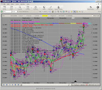
Is everything crystal clear now? Obviously not, but it reminds me how easy it can be to over analyze something. There are numerous tools within Profitsource, but you may only need a few of them to accomplish your purpose for a given stock or option strategy. I typically stay with a handful of indicators that I use over and over again. Of course, indicators that I use can be completely different than the ones you become comfortable with.
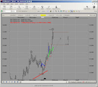
Before I pull the chart up from 02-07-07, I want you to notice something else from 02-05-07. You can notice that the Elliott Wave 5 Peak has already been met on 02-02-07, and on 02-05-07 the price action has started to move away from the peak. This by itself cannot guarantee a future direction, but as time passes, the wave count will have to correct itself one way or another.
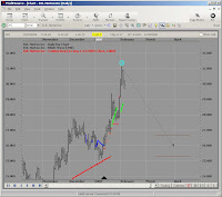
Moving forward to 02-06-07, we can see the Elliott Wave pattern has relabeled. The Elliott Wave 5 Peak has now changed to an Elliott Wave 3 Peak. The Pattern seems to leave me in a position where both the previous Wave 5 peak and the relabeled Wave 3 peak are indicating a downward directional movement.
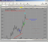
The move downward continues on 02-07-07 where the stop was executed.
And finally, the most current chart as of 02-09-07 with the initial entry and exit points
Ok, here are the final stats for the DHI trade.
1. DHIEF MAY 30 CALL was bought at a debit of $0.95 or $95.00 per contract on 01-16-07
2. Half the position was sold at a credit of $2.40 or $240.00 per contract on 02-01-07
3. The remaining half was sold at a credit of $2.00 or $200.00 per contract on 02-07-07
4. Commission prices were $12.95 per transaction. Entry + Half exit + Other Half gives a commission total of $38.85.
5. Assuming a minimum contract amount of 2, the total debit would be $228.85 ($95.00 times 2 + $38.95 commission)
6. Assuming a minimum contract amount of 2, the total credit would be $440.00
7. Assuming a minimum contract amount of 2, your profit would be $212.00 or 92.6% ROI.
8. Assuming a minimum contract amount of 10, the total debit would be $988.85
9. Assuming a minimum contract amount of 10, the total credit would be $2200.00
10. Assuming a minimum contract amount of 10, your profit would be $1211.15 or 122.4% ROI
No matter how many contracts you traded, I can live with a double.
Later
Fibonacci
PLEASE REMEMBER THIS IS FOR EDUCATIONAL PURPOSES ONLY!
If you like the blog, visit the forum at www.Primalgreed.com Let's Network!Labels: Elliott Wave, Final Stats, Profitsource, Wave 4 Buy |
| posted by Fibonacci_Trader @ 12:18 PM Add to: DiggIt! | Del.icio.us | blink it | |
|
|
|
| Primalgreed.com - BESTBUY, that's not what I wanted! Part 2 |
| Wednesday, February 7, 2007 |
PLEASE REMEMBER THIS IS FOR EDUCATIONAL PURPOSES ONLY!
Continued from Part 1
From before, I noticed that the daily and weekly trends for BBY seem to be conflicting. Since I am typically a short to mid-term trader, my attention to the longer weekly trend wasn’t an overwhelming factor for me…maybe it should have been. All that being said, I don’t care much for crying or whining over losing trades. The important thing, for me, is that I learn something from every trade that I make.

Notice from the next screen there where some other indicators that lead me down the path. First, the upper Volex was pierced. Second, the upper Bollinger band was also broken. These indicators by themselves are not persuasive, but reinforced my belief in a resistance in the price of the equity.

Looking at the 50 / 200 Simple moving average, there was a bearish crossover around 01-12-07. The 200 Simple moving average also seems to be hovering around the Elliott Wave 4 peak, and may provide further indication of resistance. The next step was to see if the trade fell into my risk/reward profile.

Applying Profitsouce’s risk to reward tool, the stop price was set at the Elliot Wave 4 peak of $51.80, the entry price was around $50.08, and the profit point was at $44.85. The timeframe for the trade was initially set at 30 days from entry. From the risk to reward tool, we can see that this is a 3.16 to 1 trade if we decided to short the stock. For stock trading this would already be a qualifier for me, but can I get a better risk to reward by trading the option on the stock?
We’ll have to see later,
Fibonacci
Continued in Part 3
If you like the blog, visit the forum at www.Primalgreed.com Let's Network!
PLEASE REMEMBER THIS IS FOR EDUCATIONAL PURPOSES ONLY!Labels: Elliott Wave, Part 2, Profitsource, Wave 4 Sell |
| posted by Fibonacci_Trader @ 12:08 PM Add to: DiggIt! | Del.icio.us | blink it | |
|
|
|
| Primalgreed.com - BESTBUY, that's not what I wanted! Part 1 |
| Monday, February 5, 2007 |
PLEASE REMEMBER THIS IS FOR EDUCATIONAL PURPOSES ONLY!
Greetings all,
Well it’s time for a losing play. We can’t always win at everything…even though we want too. One lesson that took me a long time to realize is that losses is part of trading, and if you aren’t willing to take losses than you shouldn’t be trading. The psychology of trading can be a love/hate relationship; it can give you peace of mind or drive you loco. The most important part, to me, is to prepare for the losses before I place a trade. This is where a written down or charted risk/reward can give you some guidance, and keep you from make an emotional decision (well, most of the time). Let’s move on.
 From the Profitsource precomputed scans on 01-29-07, I came across Best Buy BBY. If your not a borderline techgeek like myself, and don’t know who BBY is, check out their profile here: http://finance.yahoo.com/q?s=bby&x=0&y=0. BBY was listed as a possible Wave 4 Sell, but it was listed as a watch indicator vs. a trigger indicator on the precomputed list. If you’re unfamiliar with the difference, you can look through your Profitsource manual, search your help manual, or view a previous post here: Previous Post For right now, here is the basic chart from 01-29 07: From the Profitsource precomputed scans on 01-29-07, I came across Best Buy BBY. If your not a borderline techgeek like myself, and don’t know who BBY is, check out their profile here: http://finance.yahoo.com/q?s=bby&x=0&y=0. BBY was listed as a possible Wave 4 Sell, but it was listed as a watch indicator vs. a trigger indicator on the precomputed list. If you’re unfamiliar with the difference, you can look through your Profitsource manual, search your help manual, or view a previous post here: Previous Post For right now, here is the basic chart from 01-29 07:
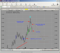
The chart seemed to pass a couple of tests at the time I placed the trade, but looking back at it, the oscillator just doesn’t seem right. Usually I like to see the oscillator moving closer to the zero line around or before the Wave 4 peak. Also, the price chart seems to be in an elongated sideways pattern between Wave 3 and 01-29-07. The TAPP shows a projected range of $45.22 by Feb 6, 07, and the Range Projector is showing a possible move to $44.85. The $44.85 level from the Range Projector has a shortest timeframe of 02-08-07, an average timeframe of 02-12-07, and the longest timeframe of 02-21-07. For those unfamiliar with the timeframe of the Range Projector, it is the vertical tick across the range projector. I will post something later with more details.

Since my 20/20 rear-view goggles are working on that oscillator, let’s look at a weekly chart from the same date. Hmm…in hindsight, the weekly chart actually looks better than the daily. It seems as if there are some Fibonacci ratios being satisfied in this chart. Lets take a look to see if anything pops up:
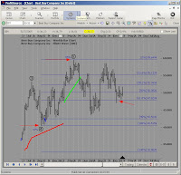
Taking the Fibonacci Retracement tool, we can see that the price action had dropped through the 61.8% range at the end of December, but there was also a big drop around July/August. I wonder what it’s Retracement might be. Let’s take a look at the next screenshot:
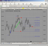
The recent low from July to the 01-29-06 seems to be confirming another direction as well. Let’s stew on that for a while, there’s a market moving somewhere!
Continued in Part 2
Later Fibonacci
If you like the blog, visit the forum at www.Primalgreed.com Let's Network!
PLEASE REMEMBER THIS IS FOR EDUCATIONAL PURPOSES ONLY!Labels: Elliott Wave, Part 1, Profitsource, Wave 4 Sell |
| posted by Fibonacci_Trader @ 11:57 AM Add to: DiggIt! | Del.icio.us | blink it | |
|
|
|
| Primalgreed.com - DHI my housing Dilemma Part 3 |
| Friday, February 2, 2007 |
PLEASE REMEMBER THIS IS FOR EDUCATIONAL PURPOSES ONLY!
Continued from Part 2
From my last post, several other indicators were added to the mix. These included Bollinger Bands, DMI, RSI, and MACD. The risk to reward tool in Profitsource was also used to confirm a projected target, and establish a possible entry and exit plan based upon the stock price. Finally, an option strategy was chosen, and the risk to reward of the option contract was compared to the risk to reward of the underlying equity. The options risk to reward and volatility view were done using Optionetics Platinum service.
My original entry point was at $0.90 per contract or $90.00. The defined stop was at $0.45 or $45.00, and the point of a half position profit-taking was at $1.85 or $185.00 per contract. That being said, my order was filled at $0.95 per contract.
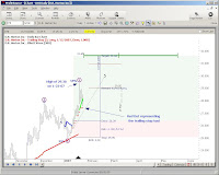 Looking back at the chart on 01-23-07 you can see that DHI made a considerable move to the upside. DHI had reached a intraday high of $29.38 and the option intraday was as high as $2.60 or $260.00 per contract. Two other things worth noting is the Elliott Wave 5 formation from the high, and the breakthrough of the $29.05 TAPP. Normally, this would be a point at which I exit the trade, but a couple of things prevented this. First, I had set my initial exit for profit-taking higher than the $2.60 of the intraday. Secondly, greed had set-in by the time I saw the contract price reach $2.60, because I still believed DHI had a considerable move to come, so I moved the stop-loss point up to the trailing stop point of around $27.41, and left the profit-taking exit the same. If you haven’t used the trailing stop function in Profitsource, I would suggest you give it a try and see if it works for you. The only gripe I have is that you can’t pick a entry date from a mouse click. This forces you to enter the date in manually. Looking back at the chart on 01-23-07 you can see that DHI made a considerable move to the upside. DHI had reached a intraday high of $29.38 and the option intraday was as high as $2.60 or $260.00 per contract. Two other things worth noting is the Elliott Wave 5 formation from the high, and the breakthrough of the $29.05 TAPP. Normally, this would be a point at which I exit the trade, but a couple of things prevented this. First, I had set my initial exit for profit-taking higher than the $2.60 of the intraday. Secondly, greed had set-in by the time I saw the contract price reach $2.60, because I still believed DHI had a considerable move to come, so I moved the stop-loss point up to the trailing stop point of around $27.41, and left the profit-taking exit the same. If you haven’t used the trailing stop function in Profitsource, I would suggest you give it a try and see if it works for you. The only gripe I have is that you can’t pick a entry date from a mouse click. This forces you to enter the date in manually.
Just a side note: After realizing my undisciplined habit of greed, I immediately started watching one of my favorite recorded episodes of Deal or No Deal. I keep this around for just such an occasion. It reminds me of how easy it is to make a winning, sure-thing trade, into a big loser. Fortunately, this time, I was saved from my own stupidity even though the markets are not generous to the hard-headed.

On 02-01-07, I exited half the position for a credit of $2.40 or $240.00 per contract, and will the let the rest of it ride as long as it doesn’t go much below the $2.00 or $200.00 range or becomes to close to expiration. At this point, the initial investment has doubled, and the open-half is essentially a free trade. As you can see, the Wave 5 formation has moved up as well.
Continued in Final Stats
I will give the final stats later.
Later, Fibonacci
If you like the blog, visit the forum at www.Primalgreed.com Let's Network!
PLEASE REMEMBER THIS IS FOR EDUCATIONAL PURPOSES ONLY!Labels: Elliott Wave, Part 3, Profitsource, Wave 4 Buy |
| posted by Fibonacci_Trader @ 8:44 AM Add to: DiggIt! | Del.icio.us | blink it | |
|
|
|
| Primalgreed.com - DHI my housing Dilemma Part 2 |
| Monday, January 29, 2007 |
PLEASE REMEMBER THIS IS FOR EDUCATIONAL PURPOSES ONLY!
Continued from Part 1
Greetings all,
From the previous post, using ProfitSource, I first came across DHI on 1/12/07. The company’s profile is listed here: http://finance.yahoo.com/q/pr?s=DHI

When we last left, I was confirming the retracement levels using both the retracement tool and the wave extension tool. I hope you have tried out both, they have different advantages and disadvantages. I also like to look at several other indicators to get a better feel of “The Picture” we talked about before. From the screen shot, you can see I have included Bollinger Bands, DMI, RSI, and MACD.
First, the lower Bollinger Band was broken a day or so before the EBOT trigger, which may signal an upward directional movement. Second, will also note that the DI+ has crossed the ADX. Third, the DI+ has also crossed the DI-. Fourthly, the RSI has crossed the RSI MA. Fifth, the short MACD has crossed over the long. After saying all that, did you look back on the circled part of the chart? It seems like these same patterns were repeated before, and followed with an upward movement. With all these considerations at hand, I decided to figure my risk to reward.
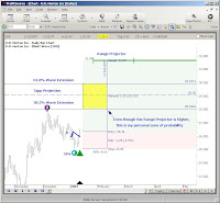
If there’s one thing that I like about the Profitsource software…it’s the risk to reward tool. It tends to save me a lot of time scanning through potential trades. Saying that, after looking at tons of charts, I already new that this chart would fall into the range of my risk to reward profile before applying the tool.
After applying the Range Projector, my initial target is 31.65. The TAPP projection is at 29.05. I also applied the wave extension tool for my 38.2% and 61.8% projections. This left me with a zone around the TAPP. The zone is marked off with the yellow square being sliced in half at 29.05, the lower part of the square at 28.04 (38.2%), and the upper limit of the square at 29.92 (61.8%). The reason why I do this, is not to ignore the Range Projectors Target, but to give me a preliminary target of possible strategy change. My risk to reward tool gave me my stop price of 25.05, an entry point of 26.34, and a timestop of Feb 12, 2007.

From here I decided to go with a straight call option. The risk to reward is 4.14 for the stock, and the May 30 Strike gives a risk to reward of 4.50. I should have compared other strikes for a greater risk to reward…but I didn’t! (Note to self: You’re an idiot). Looking at the options graph you can see the potential profit of $250.00 and the potential loss of $50.00. 250 divided by 50 gives my risk to reward of 4.50. The model price was at 0.88 with a bid/ask of 0.85/0.90 (remember you have to multiple that stuff by 100). I went with the 0.90, defined a stop at 0.45 and an exit of half the position at 1.85.

What about the Volatility? Here that view as well.
I'll wrap it up in the next post, It's almost trading time
Continued in Part 3
Fibonacci
If you like the blog, visit the forum at www.Primalgreed.com Let's Network!
PLEASE REMEMBER THIS IS FOR EDUCATIONAL PURPOSES ONLY!Labels: Elliott Wave, Part 2, Profitsource, Wave 4 Buy |
| posted by Fibonacci_Trader @ 5:57 AM Add to: DiggIt! | Del.icio.us | blink it | |
|
|
|
| Primalgreed.com - DHI my housing Dilemma |
| Sunday, January 28, 2007 |
PLEASE REMEMBER THIS IS FOR EDUCATIONAL PURPOSES ONLY!
Greetings all,
Using ProfitSource, I first came across DHI on 1/12/07. For those of your unfamiliar with the company, DR Horton is a homebuilding/financing company listed on the NYSE. For a company profile you can look here:
http://finance.yahoo.com/q/pr?s=DHI
What is interesting to me, is that the media has been bombarding our senses with the doom and gloom of the real estate market for quite awhile. I've always been a "against the masses" type of guy, but I've also made the mistake of being "against the general market". Here lies the dilemma. Do I really think the housing market is all doom and gloom, or do I think the big boys are looking at opportunity. For now, here's the chart I saw on 01/12/07:
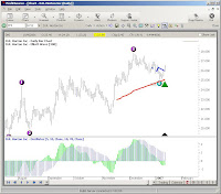 For me, I don't feel frisky about pulling up a precomputed scan, selecting a risk to reward ratio that's acceptable and then placing the trade. I think their are several questions that need to be asked before moving forward. For me, I don't feel frisky about pulling up a precomputed scan, selecting a risk to reward ratio that's acceptable and then placing the trade. I think their are several questions that need to be asked before moving forward.
1. I know that Profitsouce will pull up these scans by criteria already set, but I still like to confirm these criteria by hand. At the very least, it allows you to become more familiar with the software tools.
2. Before I go through all that business, "THE PICTURE" still has to be right (i would say feel right, but that has got me in trouble before). In my experience, the closer the chart looks like a true Elliott wave pattern, the closer it seems to be in reality. All those charts with huge swings, gaps up and down, etc have their place, but that volatility thing can make or break ya. There's nothing worse than seeing a trade that goes in the intended direction, but the option's price is stagnant or decreases. Being primarily an option trader Volatility has become my best friend and my worst enemy. And since I'm looking at this from the biased eyes of an option's trader, I still have to pull up a risk graph from another source to see if it's Picture is inline with my overall strategy.
3. What is the long term picture looking like. It's great to take a snapshot of few weeks of data, but where has the price been before. This is always important to analyze points of support and resistance. It also lets you get an idea of how big a swing will effect the price based on past events, earnings, news, upgrades, downgrades, etc. The first chart was a daily graph from a small time frame and the next chart is the weekly view over several years.
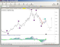
Notice how the wave patterns for the long-term and short term are strikingly different.

4. Wow, did you notice the TAPP's. The first screen shot cut it off, but its 29.05 by March 14,2007. The weekly chart has a TAPP of 16.03 by August 10,2007. Well which way is it going to go, thats a range of 13.02. Maybe none, maybe both. I do know that once you start applying the range projector tool, the tool itself will have no directional bias in its forecasting. Don't take my word for it, check out the Profitsouce tutorials and they will say the same thing. So if we go back to the original daily chart we can have two possible targets to view. Look to the left:

5. Overlaying the 21, 50, and 200 SMA, you can see several different results. I would classify myself as a short to mid-term trader so the 21 day SMA works fine for me. This allows me to get a feel of the short term movement over the last 3 weeks. The 50/200 SMA is one I almost always use primarily because everyone else does. Sometimes, it feels as though the 50/200 SMA becomes a self-fulfilling prophecy... at least in the short-term. Whether it truly predicts the price movement in the long-term is less important to me than whether the majority of investors BELIEVE it predicts the price movement. If the antelope herd is being chased up hill by a lion, so be it...even if the lion turns out to be a....monkey..no...a giraffe...no...probably another ANTELOPE. You can also see that the EBOT has been satisfied. Here's the view:
6. I had mentioned earlier about confirmation of the EW pattern early. Next we will confirm that the that the ratios look right. Just a side note: I always like to perform a custom Data on Demand of a least 5 years to make sure my data doesn't have any holes in it. Well, how much should Wave 4 Pull back, and what tool can I use. For the EW4B Pattern, the range is usually between 24-62%. I use two different tools to perform the confirmation and you can use either one. The first one is the Fibonacci Retracement tool and the second is the Wave extension tool. The first screen shot includes the tools, the other two represent the final display of the two tools, and how they look a little different.

Fibonacci Retracement Tool and Wave Extension Tool in the Drawing tools Menu

Application of Fibonacci Retracement Tool on Price Chart

Application of Wave Extension Tool on Price Chart
Check back with me later....I'm not finished yet
Continued in Part 2
By the way, the STZ trade posted earlier was a losing trade and I'll finish it up too
Later, Fibonacci
If you like the blog, visit the forum at www.primalgreed.com Let's Network!
PLEASE REMEMBER THIS IS FOR EDUCATIONAL PURPOSES ONLY!Labels: Elliott Wave, Part 1, Profitsource, Wave 4 Buy |
| posted by Fibonacci_Trader @ 1:53 PM Add to: DiggIt! | Del.icio.us | blink it | |
|
|
|
|
|


