|
| Profitsource Bollinger Bands and Standard Deviation |
| Monday, March 5, 2007 |
PLEASE REMEMBER THIS IS FOR EDUCATIONAL PURPOSES ONLY!
Continued from Part 1
Greetings, I hope recent market downturn hasn't discouraged you.
Previously, we had dived into Profitsource trying to discover the Bollinger Band Tool. From earlier, we discovered that Bollinger Bands had early origins in Trading bands. Trading bands form off a centerline, which is a configurable moving average. The Outer bands from Trading bands can be adjusted by a given percentage, up or down, from the moving average. Now we move on to Bollinger Bands
Earlier, we had discovered that Bollinger Bands are based upon Standard Deviation, and I'm sure many stopped and said "OH NO!" Not to worry, I had to do a little refresher research myself.
Sidenote: If you are currently using Bollinger Bands for trading signals, confirmation, etc, and don't already have a decent grasp on most of this...SHAME ON YOU!
 Q: Well, what is standard deviation? Q: Well, what is standard deviation?
A: Standard deviation is based upon the average or mean of a data group. The standard deviation itself expresses a clustering or grouping density around the mean. This is visually represented in a bell graph. A bell graph is to the left, Courtesy of Wikipedia. The dark blue represents One Standard Deviation from the mean. The lighter blue represents Two Standard Deviations from the mean, and the lighest blue indicates Three Standard deviations. For example, my data sample could include the total amount of cookies baked in 2006, and how many chocolate chips are in each of them. The centerline drawn down through the peak of the graph could represent the average amount of chocolate chips per cookie over the entire data group. The dark blue would indicate that 68.26894921371% of my cookies have a One Standard Deviation amount of chips from the mean. The lighter blue would indicate that 95.44997361036% of my cookies have a Two Standard Deviation amount of chips from the mean. Keep in mind that Two Standard deviations is the first deviation plus the second deviation. I could keep going on, but I'm starting to get hungry...munch...munch.

Now that I finished brushing the crumbs off the keyboard, can you see how this would apply to equity price movement? If I'm going to use Bollinger Bands, I probably need to get an idea of the size of my data group size and I also need to determine how many Standard Deviations I want to include for my given sample size. Looking at Profitsource's Bollinger Band Tool Properties, I see that both of these fields are available for me. The periods would be my Data Group, and the Standard Deviations would be the amount of Standard Deviations I want to apply to the Data Group.
Here is a list of the percentage of data from the data group that will fall under various standard deviations.
One Standard Deviation 68.26894921371%
Two Standard Deviations 95.44997361036%
Three Standard Deviations 99.73002039367%
Four Standard Deviations 99.99366575163%
Five Standard Deviations 99.99994266969%
Six Standard Deviations 99.99999980268%
Seven Standard Deviations 99.99999999974%
Deviation Percentages courtesty of Wikipedia
Before you start getting all excited, remember that the accuracy of these percentages depends on the size of the Data Group. Let me show you a couple charts from Profitsource to make things a little clearer.

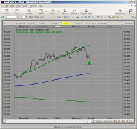
Here is a chart with the data group being set to Profitsource's default. The default setting is 20 periods (data group), and 2 standard deviations. Notice how the majority of the price movement is included, but not all. Two standard deviations should include 95.44997361036%, but this doesn't look to be the case. If the periods or data group was larger, these percentages might fall into place. Lets changes some parameters and see what happens.

Here is the same chart, but with the amount of standard deviations changed to 4 instead of 2. Now, even though our sample is small, all the data is encompassed by the Bollinger bands. What if we had left the Standard Deviations at 2 and just increased the data group? Let's try that one as well, but I'm sure it will not be the result most people expect.
Wow, what happened here? The standard deviations was set to 2 and the periods where changed to 200 versus 20. You would think that increasing the data group or periods size would make the Bollinger Bands all encompassing. If we keep in mind that the standard deviation is a measurement from the mean, maybe things will become more clearer. Remember that a recent large price movement or trend can skew the graph. Let's back the chart up a little
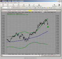
You can see now that there has been some serious movement over the last 200 days. Most of the movement seems to be hugging the upper band, but there was a lot of movement below the band as well. So is the data group or period encompassing 95.44997361036% of the price? Not exactly, but the larger the sample, the closer the percentages.
Don't take my work for it though, try some of this stuff yourself and see what you come up with. I have more to come, but if your like me, you have to digest this slowly....where are those cookies?
To be Continued in Part 3
Later Fibonacci
PLEASE REMEMBER THIS IS FOR EDUCATIONAL PURPOSES ONLY!
If you like the blog, visit the forum at www.Primalgreed.com Let's Network!Labels: Bollinger Bands, Part 2, Profitsource, Standard Deviation |
posted by Fibonacci_Trader @ 7:30 AM Add to: DiggIt! | Del.icio.us | blink it |   |
|
|
|
| Primalgreed.com - BESTBUY, that's not what I wanted! Part 2 |
| Wednesday, February 7, 2007 |
PLEASE REMEMBER THIS IS FOR EDUCATIONAL PURPOSES ONLY!
Continued from Part 1
From before, I noticed that the daily and weekly trends for BBY seem to be conflicting. Since I am typically a short to mid-term trader, my attention to the longer weekly trend wasn’t an overwhelming factor for me…maybe it should have been. All that being said, I don’t care much for crying or whining over losing trades. The important thing, for me, is that I learn something from every trade that I make.

Notice from the next screen there where some other indicators that lead me down the path. First, the upper Volex was pierced. Second, the upper Bollinger band was also broken. These indicators by themselves are not persuasive, but reinforced my belief in a resistance in the price of the equity.

Looking at the 50 / 200 Simple moving average, there was a bearish crossover around 01-12-07. The 200 Simple moving average also seems to be hovering around the Elliott Wave 4 peak, and may provide further indication of resistance. The next step was to see if the trade fell into my risk/reward profile.

Applying Profitsouce’s risk to reward tool, the stop price was set at the Elliot Wave 4 peak of $51.80, the entry price was around $50.08, and the profit point was at $44.85. The timeframe for the trade was initially set at 30 days from entry. From the risk to reward tool, we can see that this is a 3.16 to 1 trade if we decided to short the stock. For stock trading this would already be a qualifier for me, but can I get a better risk to reward by trading the option on the stock?
We’ll have to see later,
Fibonacci
Continued in Part 3
If you like the blog, visit the forum at www.Primalgreed.com Let's Network!
PLEASE REMEMBER THIS IS FOR EDUCATIONAL PURPOSES ONLY!Labels: Elliott Wave, Part 2, Profitsource, Wave 4 Sell |
| posted by Fibonacci_Trader @ 12:08 PM Add to: DiggIt! | Del.icio.us | blink it | |
|
|
|
| Primalgreed.com - DHI my housing Dilemma Part 2 |
| Monday, January 29, 2007 |
PLEASE REMEMBER THIS IS FOR EDUCATIONAL PURPOSES ONLY!
Continued from Part 1
Greetings all,
From the previous post, using ProfitSource, I first came across DHI on 1/12/07. The company’s profile is listed here: http://finance.yahoo.com/q/pr?s=DHI

When we last left, I was confirming the retracement levels using both the retracement tool and the wave extension tool. I hope you have tried out both, they have different advantages and disadvantages. I also like to look at several other indicators to get a better feel of “The Picture” we talked about before. From the screen shot, you can see I have included Bollinger Bands, DMI, RSI, and MACD.
First, the lower Bollinger Band was broken a day or so before the EBOT trigger, which may signal an upward directional movement. Second, will also note that the DI+ has crossed the ADX. Third, the DI+ has also crossed the DI-. Fourthly, the RSI has crossed the RSI MA. Fifth, the short MACD has crossed over the long. After saying all that, did you look back on the circled part of the chart? It seems like these same patterns were repeated before, and followed with an upward movement. With all these considerations at hand, I decided to figure my risk to reward.
If there’s one thing that I like about the Profitsource software…it’s the risk to reward tool. It tends to save me a lot of time scanning through potential trades. Saying that, after looking at tons of charts, I already new that this chart would fall into the range of my risk to reward profile before applying the tool.
After applying the Range Projector, my initial target is 31.65. The TAPP projection is at 29.05. I also applied the wave extension tool for my 38.2% and 61.8% projections. This left me with a zone around the TAPP. The zone is marked off with the yellow square being sliced in half at 29.05, the lower part of the square at 28.04 (38.2%), and the upper limit of the square at 29.92 (61.8%). The reason why I do this, is not to ignore the Range Projectors Target, but to give me a preliminary target of possible strategy change. My risk to reward tool gave me my stop price of 25.05, an entry point of 26.34, and a timestop of Feb 12, 2007.

From here I decided to go with a straight call option. The risk to reward is 4.14 for the stock, and the May 30 Strike gives a risk to reward of 4.50. I should have compared other strikes for a greater risk to reward…but I didn’t! (Note to self: You’re an idiot). Looking at the options graph you can see the potential profit of $250.00 and the potential loss of $50.00. 250 divided by 50 gives my risk to reward of 4.50. The model price was at 0.88 with a bid/ask of 0.85/0.90 (remember you have to multiple that stuff by 100). I went with the 0.90, defined a stop at 0.45 and an exit of half the position at 1.85.

What about the Volatility? Here that view as well.
I'll wrap it up in the next post, It's almost trading time
Continued in Part 3
Fibonacci
If you like the blog, visit the forum at www.Primalgreed.com Let's Network!
PLEASE REMEMBER THIS IS FOR EDUCATIONAL PURPOSES ONLY!Labels: Elliott Wave, Part 2, Profitsource, Wave 4 Buy |
| posted by Fibonacci_Trader @ 5:57 AM Add to: DiggIt! | Del.icio.us | blink it | |
|
|
|
| Elliott gave me the go, STZ gave me some Sidestepping Part 2 |
| Saturday, December 30, 2006 |
PLEASE REMEMBER THIS IS FOR EDUCATIONAL PURPOSES ONLY!
Continued from Part 1
STZ (Constellation Brands)
We left off with the chart from 10-16-06, but I usually look for some form of directional move after the signal sign. ProfitSource divides its precomputed scans into two different types. The ones with the funky looking red and green triangles fall under the Trigger category and the ones with the eyeglasses fall under the Watch category.
 Trigger Indicators : These can be long or short Elliott indicators depending on your category of scan, but these are new opportunities that have recently been found. Trigger Indicators : These can be long or short Elliott indicators depending on your category of scan, but these are new opportunities that have recently been found.
Watch Indicators : If the "Trigger Indicated" opportunities stay in the defined Elliott Wave criteria for more than one consecutive trading session, they move on over into this category. According to the ProfitSource manual this indicator also applies to " all other results of other precomputed scan types". I'll try to get some more info on that...Note to self.
So which one do I go with? I think the consensus is still teetering back and forth, but on this particular trade I waited for STZ to show me those geeking looking glasses. Mostly, I think which one you choose will depend on the individual. Note to Self: What has been the historical performance of entering a position from the initial Trigger vs. Watch.
 Pulling the chart back up, I noticed a couple of things. First, since around the beginning of August 2006 until the beginning of October it was on a steady climb. Secondly, at the beginning of October it took a nose dive faster than a cocaine heartbeat. Thirdly, from the day after the nose dive, it has been holding its own. So what did I make of all this? To be honest, I didn't make anything out of this. Looking back at the start of the climb, I can see that there was some news generated about the Consolidating their operation, and making it streamline on August 2, 2006. There was some other news back in July 2006 about a joint venture with Grupo Modelo. Using some technicals, you could see that the 50/200 SMA was a bullish cross around August 8, 2006. What about the nose dive? The nose dive happened when STZ was in-line with expectations, but 2nd Qtr net income dropped on higher sales. What about the "holding its own" right now? Well, thats were we are. Pulling the chart back up, I noticed a couple of things. First, since around the beginning of August 2006 until the beginning of October it was on a steady climb. Secondly, at the beginning of October it took a nose dive faster than a cocaine heartbeat. Thirdly, from the day after the nose dive, it has been holding its own. So what did I make of all this? To be honest, I didn't make anything out of this. Looking back at the start of the climb, I can see that there was some news generated about the Consolidating their operation, and making it streamline on August 2, 2006. There was some other news back in July 2006 about a joint venture with Grupo Modelo. Using some technicals, you could see that the 50/200 SMA was a bullish cross around August 8, 2006. What about the nose dive? The nose dive happened when STZ was in-line with expectations, but 2nd Qtr net income dropped on higher sales. What about the "holding its own" right now? Well, thats were we are.
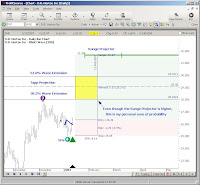
My next step was figuring what my Maximum Risk, Maximum Reward would be on the trade. If there's one tool I like the best in ProfitSource, it has to be the Risk to Reward tool. Click on the tool, click on your entry price, click on your stop price, and drag and click for your target and time criteria. Ahhhh.....I'm in charting heaven! But before I can use that, I need a target..don't you think! Well maybe that's were the Range Projector tool might help out. The Range Projector gives me a probable price target and time frame that is statically likely based upon swing levels and turning points. Note to Self: That seems like a mouthful, why don't you explain the settings and how they work...maybe you need to learn a little more
 Here is the chart after the range projector and risk to reward tool has been applied. The one thing that I didn't notice for the longest time was the three vertical ticks on the Range Projector bar. The Range Projector bar on the screen capture is green. The first tick (to the left of the screen) indicates the shortest time frame that the price is expected to be achieved. The Second Tick is the average time frame, and the Third tick is the longest time frame. This can be very useful depending upon your trading style. Here is the chart after the range projector and risk to reward tool has been applied. The one thing that I didn't notice for the longest time was the three vertical ticks on the Range Projector bar. The Range Projector bar on the screen capture is green. The first tick (to the left of the screen) indicates the shortest time frame that the price is expected to be achieved. The Second Tick is the average time frame, and the Third tick is the longest time frame. This can be very useful depending upon your trading style.
Now that we have determined my Risk to Reward and time frame, the question is still..should I take the trade? Even if I do take the trade, what strategy will I take in this trade. Will it be an option trade, a stock trade, some form of spread. One thing I do know, if you don't have your questions answered before getting into a position, your backwards looking 20/20 specs will answer it for you.
To be Continued in Part 3
Fibonacci
PLEASE REMEMBER THIS IS FOR EDUCATIONAL PURPOSES ONLY!Labels: Elliott Wave, Part 2, Profitsource, Wave 4 Buy |
| posted by Fibonacci_Trader @ 8:47 AM Add to: DiggIt! | Del.icio.us | blink it | |
|
|
|
|
|


